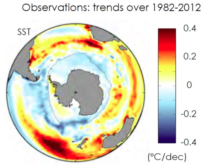
Observed sea surface temperature (SST) trends for 1982-2012 in °C/decade. The blue areas around Antarctica correspond to cooling and the red/yellow areas further equatorward, correspond to warming. The index plotted from model simulations in the ‘spaghetti diagram’ in the figure below is the SST averaged between 55S (roughly corresponding to the tip of South America) and 70S latitudes.

